
Getting started with D3.js
I’ll be the first to admit that my javascript skills are pretty much non-existent and frankly it’s something I’ve put off for a while. So…

I’ll be the first to admit that my javascript skills are pretty much non-existent and frankly it’s something I’ve put off for a while. So when I signed up for a data and visual analytics course for this coming fall, I figured I better start trying to figure things out as sections of the course focus on D3.js.
Like a lot of folks, my experience in working with charts and plots primarily extends to creating static images with matplotlib and ggplot. While matplotlib and ggplot are great for static images, they don’t really lend themselves well to interactive web apps. It’s important to note here that there are other packages like Plotly and Bokeh that can help create interactive apps as well as the folks at R Studio (now Posit.co) with their Shiny package (Shiny for python). Finally, since this post is about Javascript and D3, I feel I’d be remiss if I didn’t mention that Apache ECharts seems to be catching up to D3’s popularity. (Gitlab chooses ECharts, Apache Superset)
So what is D3.js and how do you get started?
From the D3 site, it is described as:
D3.js is a JavaScript library for manipulating documents based on data. D3 helps you bring data to life using HTML, SVG, and CSS. D3’s emphasis on web standards gives you the full capabilities of modern browsers without tying yourself to a proprietary framework, combining powerful visualization components and a data-driven approach to DOM manipulation.
For the rest of this post, I’ll describe what worked for me in getting started with D3 and hopefully it will help jumpstart you in your D3 adventures.
Before getting started, you need a good IDE or text editor. I personally like the JetBrains products while many of my friends like VSCode.
Once you have your IDE and are comfortable with it, we need to make a folder structure to contain our first D3 project.
The way I structure my project is to create a top level folder (i.e. IrisScatter) and place everything underneath. In the image below you can see that I have two different projects: IrisScatterBasic and IrisScatterAnimated (take a guess which data set I used for this post)
I separate the CSS, js (java script) and data files into their respective folders while the main index.html and favicon.ico files sit in the top level folder (IrisScatterBasic or IrisScatterAnimated).
As you can see, I have a single style.css file in the CSS folder. For the purposes of this post, I left the style.css file blank. For the data set, I used the famous Iris data set which is placed in the data folder and all the D3 javascript files are in the js folder. The favicon.ico file is not necessary but is nice to have to prevent the web server from complaining about it being missing. If you want your own favicon.ico, you can get one here.

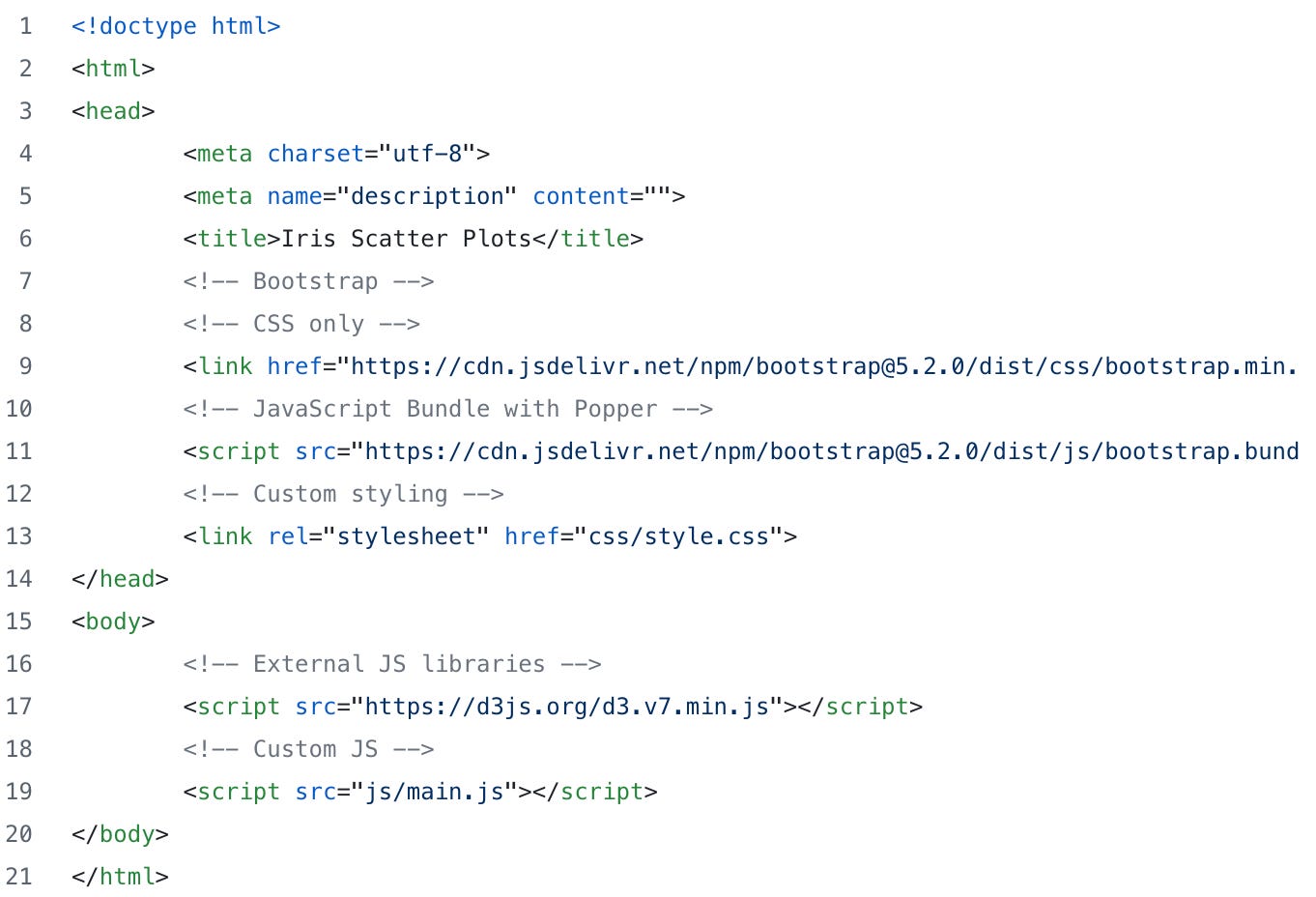
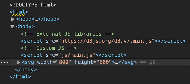
Finally, I have the index.html file sitting in the top level folder (IrisScatterBasic and IrisScatterAnimated). Note that the index.html is basically empty with the exception of a bit of bootstrap code and a couple more lines pointing to the empty style sheet (style.css), our D3 javascript file (main.js) and most importantly the main d3 javascript files (d3.v7.min.js).
Next we before we do any D3 hacking, we need to install some kind of local web server to help us view our charts as we build them up. For my projects, I chose the Node.js http-server.
To install the web server, simply install Node.js then run the command “npm i http-server”. Once it’s installed, all you need to do is run the command “http-server” from the top level directory (IrisScatterBasic or IrisScatterAnimated)
Big note here as I just discovered as I was writing this — WebStorm has a built-in web server. All you need to do is point a web browser at http://localhost:63342/<your project folder>. Assuming you got the correct path, you should see your D3 plot.
Finally!!! Now we can start hacking some D3 plots!
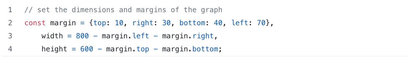
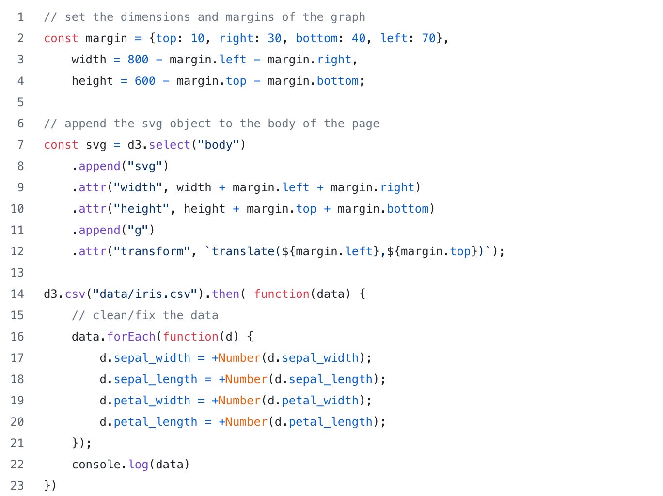
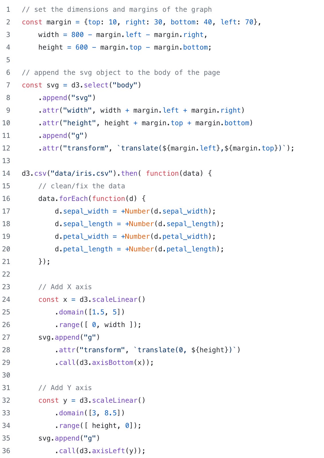
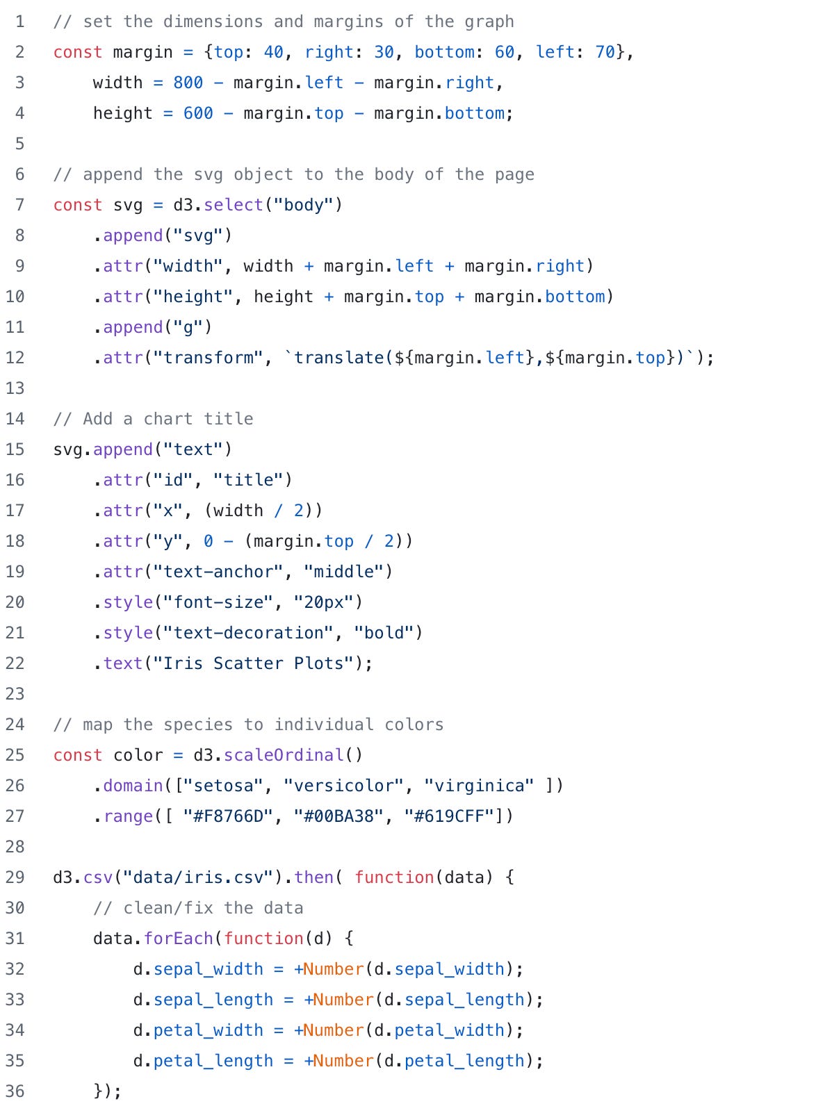
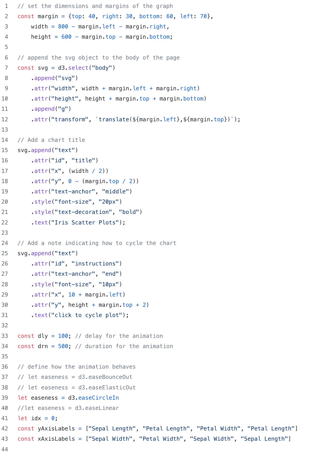
To begin building our Iris plot, we need to start with the basics by defining margins and dimensions of the plot. To do that we need to create a “margin” key/value pair and a couple of height and width variables:
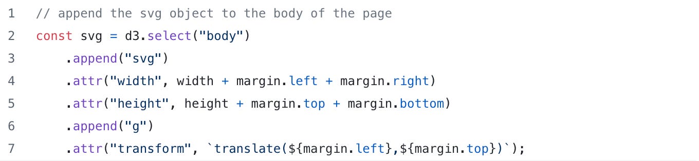
Next we need to append an SVG element to the body of our HTML file. We do that with d3.select and append functions. We define the attributes of the SVG with d3’s attr function. Using attr, we can specify attributes for any HTML tag.
If you are running the web server in the top level directory, you should be able to reload the page in your web browser and see that we now have an SVG element added to our index.html file. (Note: In your web browser, you’ll need to open the developer tools to see the new additions to the HTML file)
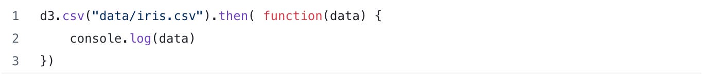
Next we need to read in the iris data to help us build our chart. To do that, D3 has a couple of nice functions to read csv and json data.
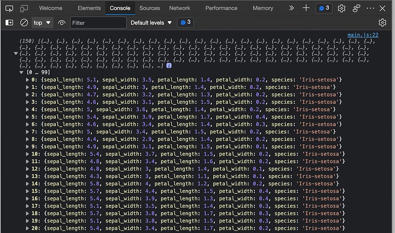
To read in our iris data and start using it for out chart, we can use the d3.csv function. In the example, below we read in the iris.csv file and output the data to the browser console:
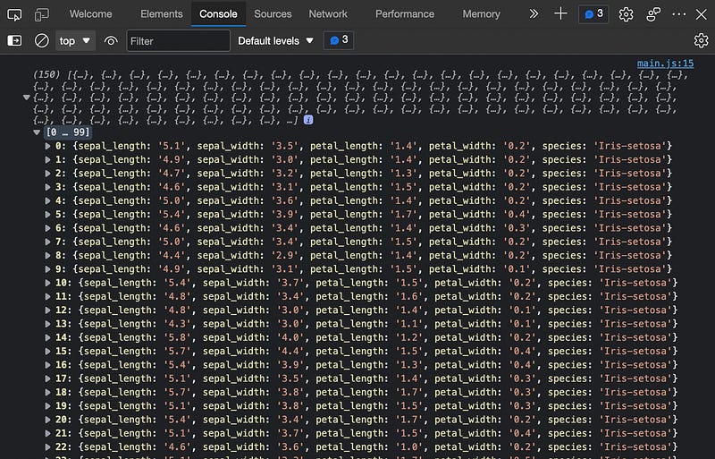
This is great! As you can see, D3 was able to read in the iris data and send it over to my browser. But…. pay attention here! Notice that the numerical values in the console output are actually string data. That’s not good. To fix this, we need to add a bit of clean up code to make sure that our values are numeric and not strings. We can fix this by adding a forEach statement that iterates over the data and converts the numbers from string to numeric.
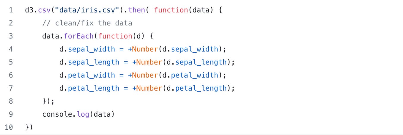
Note that the numbers in our iris data are no longer strings:
As a quick check point, if you are following along this is what our main.js file currently looks like. Pretty simple, right?
Now! Here’s where the fun begins!
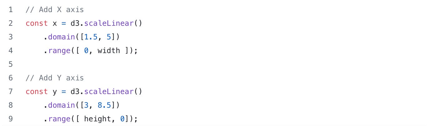
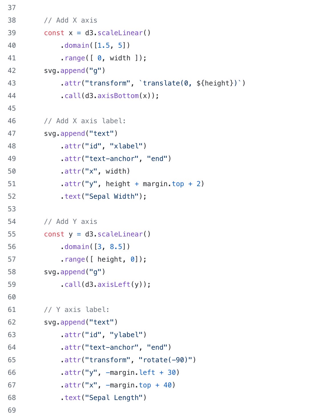
Let’s first start by adding the X and Y axis. To do that we need to first create a scale. D3 scales work by taking the domain of your data and mapping to the range on the axis. For example, if the iris data is on the domain 1.5 to 5 then the D3 scale function will map it to the range on the axis say of 0 to the width of the drawing ([1.5, 5] → [0, 800]). Note there are many different ways to scale the data, but for this plot we will simply use a Linear scale.
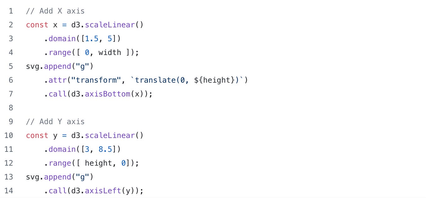
Next we need to add the actual X and Y axis. To do that, we add an HTML “g” element and then call the d3.axisLeft and d3.axisBottom while passing in our scale objects from above. Note that the “g” element is used to group SVG shapes together; we will use the “g” element to group the axis pieces together (i.e. tick marks, numbers, etc).
When we refresh our browser, our plot now has a nice X and Y axis:
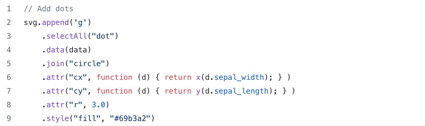
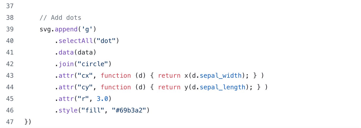
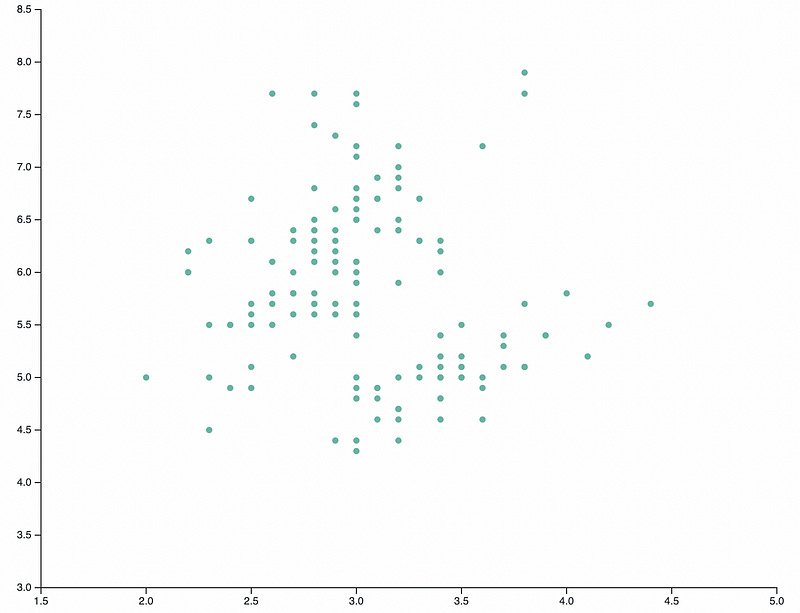
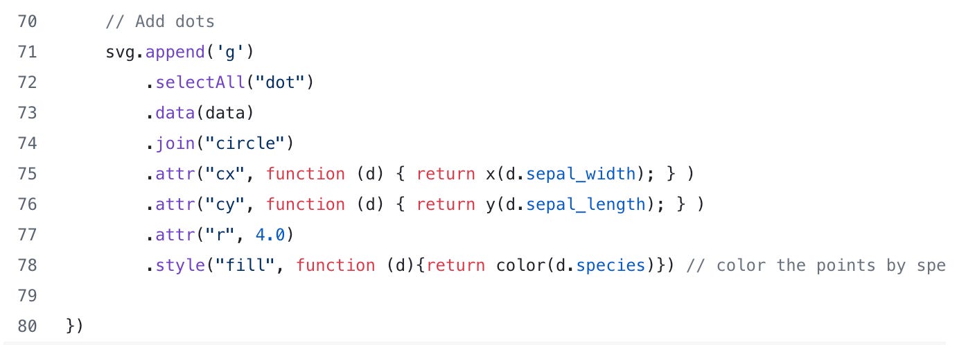
Finally, let’s add the sepal width and sepal length points to the plot. To add the points to the chart, it’s a little tricky. You need to append another “g” element, then“selectAll” the dots, add the data, then “join” on the circles and specify the point locations and radius.
Wow okay… that was a lot.
Take a look at the code below. Note for the “cx” and “cy” attributes, we call an anonymous function that returns the scaled data for sepal width and sepal length. We also specify the point color and size (or radius “r”).
As another quick check point, here is what the main.js file currently looks like:
When we refresh the browser, we now have a nice little scatter plot:
Okay this is great but we still need things like some axis labels, maybe a chart title and we need to distinguish the different species of iris (setosa, virginica, and versicolor).
Additionally, there’s nothing really special about our plot in terms of interactivity or animation; I could have done this in ggplot or matplotlib!
So how do we make this better and take advantage of the power of D3?
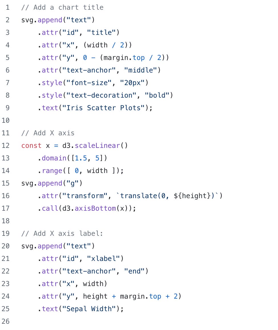
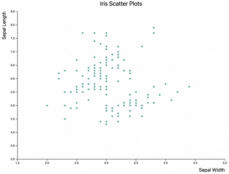
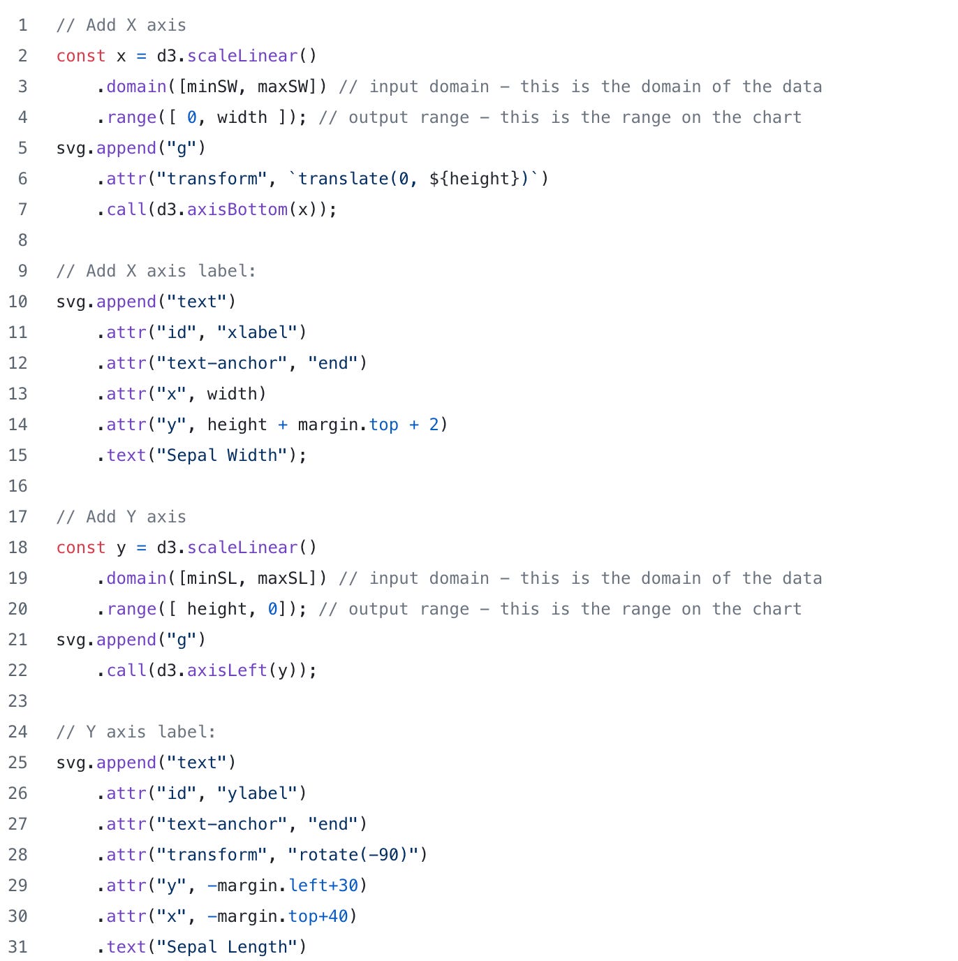
To make our chart better, let’s start by labeling our X and Y axis and adding a title. In the code snippet below, we can see where we originally added the X and Y axis but we also have a some new code that adds the labels and the title. To add the labels, we use the append function to add a “text” element to our HTML file. Each text element will have an “id” attribute (xlabel, and ylabel), we anchor the text at the end, specify the x and y coordinates then add the actual text we want to use for the labels (“Sepal Width” and “Sepal Length”).
When we refresh the browser page, we now have some nice labels for the axes and our chart title. Looking better!
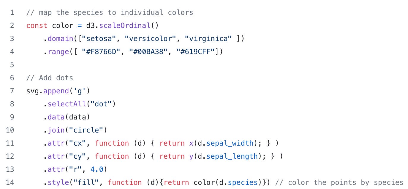
Because we are interested in the different iris species, it would really be nice to identify which of the points belong to setosa, virginica, or versicolor. To do this, we can use the scaleOrdinal funtion. Remeber we used scaleLinear for the axes and that D3 has many different ways to scale the data. For categorical data, we can use scaleOrdinal and have it map the species to different colors.
In the code snippet below, we create an ordinal scale object called “color” that maps the iris species name to a color. To color the points by species name, we need to update the the code that creates our points to use the new scaleOrdinal object. Note the anonymous function in the style() function.
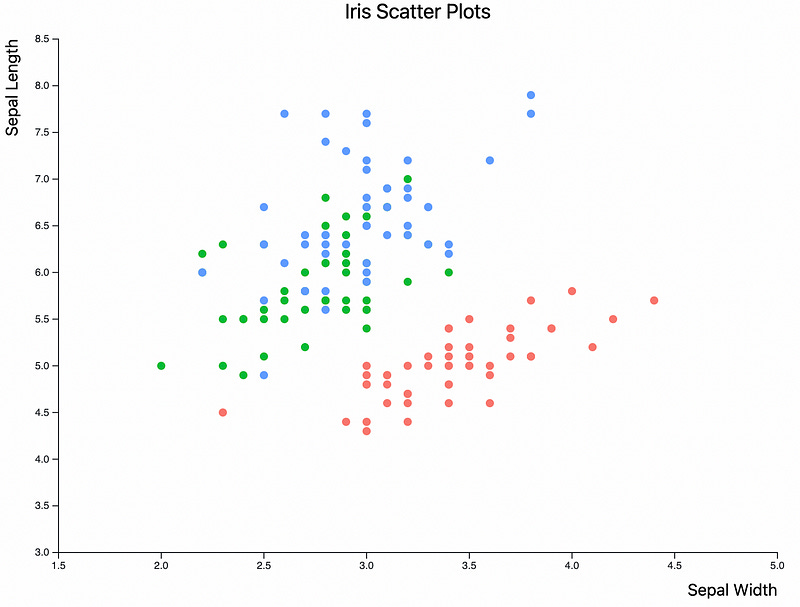
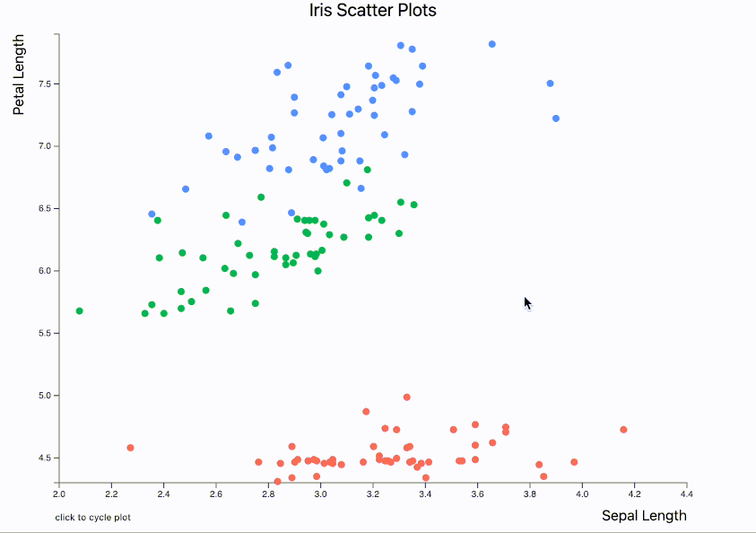
Refreshing our browser tab, we can now see that the points are colored by species. This is great! We can now identify the different species.
Note: Since we didn’t include a legend in this chart, extra credit to folks that figure out how to add one
Quick check point: Here’s what our main.js currently looks like:
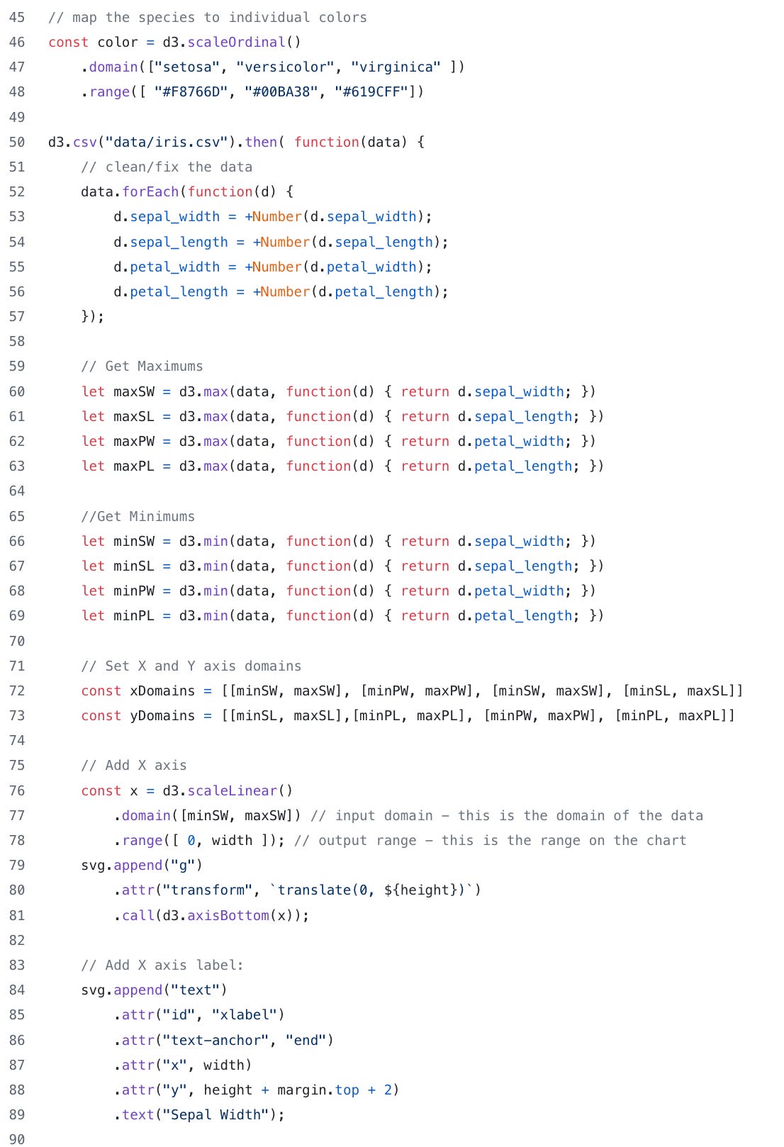
Now we have a pretty nice chart but we it’s still not interactive and there’s no animation. Since the iris data set has different petal lengths and widths and sepal length and widths we can create a chart that cycles through different plots when the image is clicked. For example petal vs sepal and width vs length.
To get started with making our chart more interactive, let’s start by defining a few things.
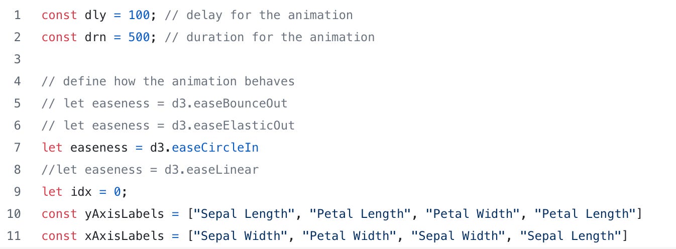
In the code snippet below, I have defined a few constants. The “dly” variable will define the milliseconds to wait before starting the animation. The “drn” variable will be used to define how long the animation should take. The “idx” variable is a counter that will keep track of where we are when cycling through the animations. I also define a couple of arrays that will contain the X and Y axis names. For example, the initial (idx=0) plot will be Sepal length vs Sepal Width where as the last plot (idx=3) will be Petal Length vs Sepal Length.
Finally, I define a variable called “easeness”. This is a fun little D3 function that defines how the animation will behave. For example, will the scatter points “bounce” to their next position or elastically snap into place?
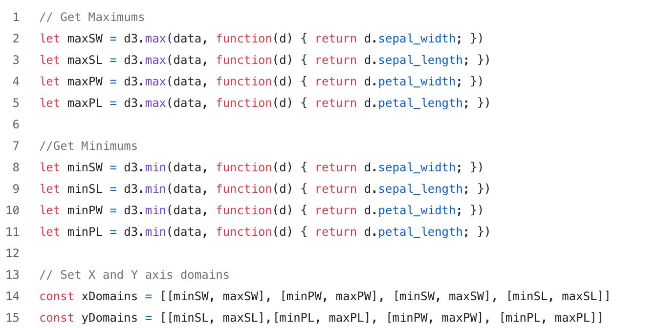
Next, we need to fix the domains on the X and Y axis. In the simple versions of our chart, we hard coded the domains to be [1.5, 5] and [3, 8.5]. This is fine for static images but since our plots will be changing, our X and Y axes need to be a bit more dynamic. To do that, D3 has and min and max function that we can use. We have also created a couple of arrays called xDomains and yDomains that we will use to specify which domain to use in our axis (These will be use further down in the code when we get to the update function).
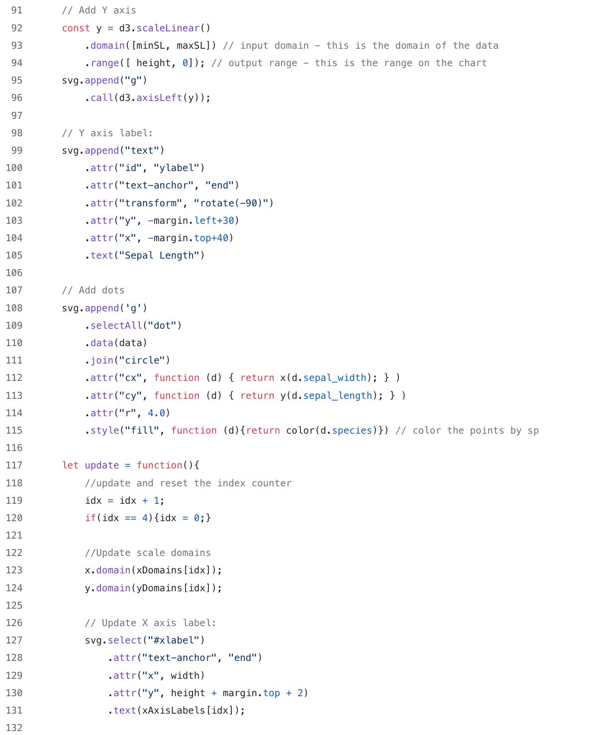
Now that we have our variables defined, let’s go ahead and redefine the X and Y axis. Note the domain functions now use the min and max values: domain([minSW, maxSW]) and domain([minSL, maxSL])
Next we will define an update function that will update the chart and handle the animation. It’s a fairly large function so I’ll try to break it down a bit.
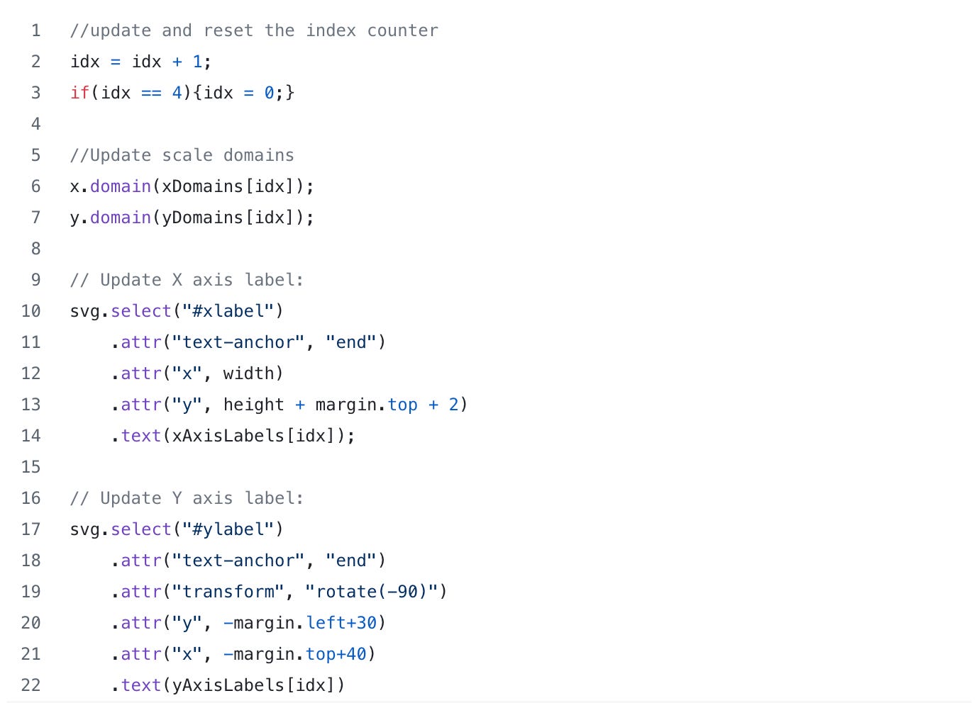
First, we want to increment the counter and create a check to reset it if the index hits 4.
Next we update the x and y domain using idx and the xDomains and yDomains array to select the x and y min and max values. (See code snippet below)
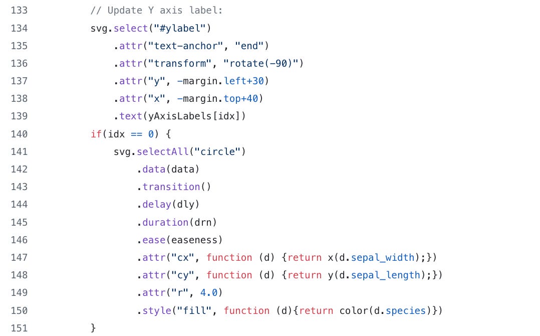
Next we update the X and Y axis labels. Take note that we are selecting “#xlabel: and “#ylabel” and these are the id attributes we specified in the creation of the axis labels. Also note that we are using the idx varible to select which labels we will use for the graph.
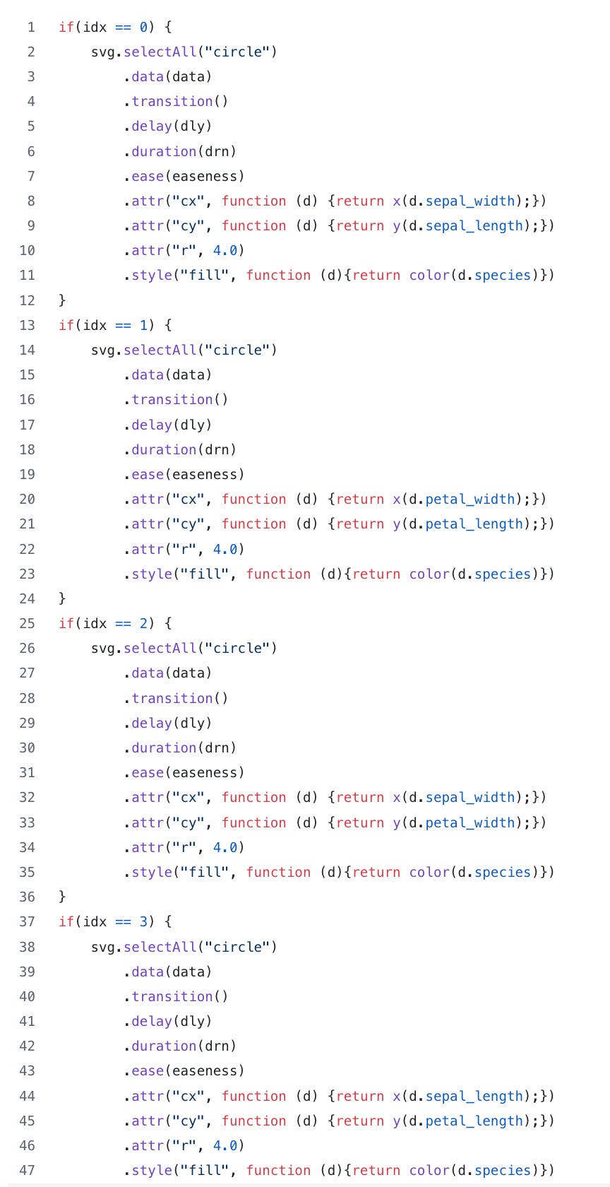
After we have updated the X and Y axis, we need to update the points on the chart. There a few key things that need to be pointed out. First observe how we select all the circles in the chart then call the data function. The big take away for this whole blog post is in the transition, delay, duration and ease functions. These four functions define how the chart will be animated. The transition lets you smoothly animate between different chart states. As mentioned above, the delay function (with the “dly” variable) define when the animation will start and the duration function with the “drn” variable define how long the animation will take. Finally, the ease funtion is a method of distorting time to control apparent motion in the animation; it defines how the motion behaves. Finally, we need to update the points based on the new data (sepal width vs length, sepal length vs petal length, etc.)
Quick comment on code quality: there’s probably a better/cleaner way to do this but this is what worked for me. Perhaps we could have used a switch statement and another function call to eliminate code duplication?
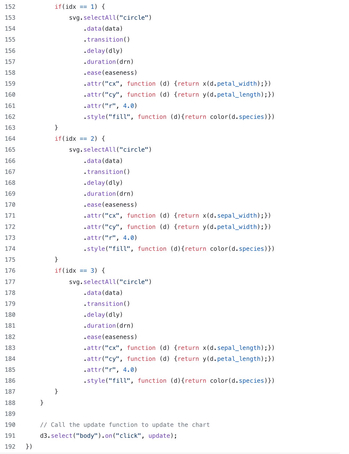
Finally, how do we deal with interactivity? For this plot, I chose to simply accept a mouse click on the body of the HTML document to update the chart.
Look how simple that is. That’s it. Amazing!

So after creating the update function and calling it with the “on” function our chart animation should look like this when we refresh our browser tab and click on the chart. (click the link to see animation)
As one final check point, this is what the main.js file should look like:
Wow! I didn’t think this post would be this long but if you made it this far, first of all, thanks for reading and hopefully this will help you get started with D3.
As for me, I’m off to keep practicing D3 for my class this coming fall.